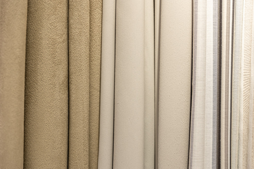
Neutral colors are the go to choice for window coverings, and for good reason. They fit almost any room, they do not fight the rest of the decor, and they stay in style far longer than trendy colors. When you pick a neutral, you are choosing a covering that works now and keeps working as you change the furniture, repaint, or update the room over the years. That flexibility is why so many people land on neutrals in the end.
Here is a look at the popular neutral colors for window coverings and how to pick the right one for your space.
Why Neutrals Work So Well
Neutrals earn their popularity by being easy to live with. They do not clash with other colors, so they work with the furniture, walls, and decor you already have. They stay quiet, letting the rest of the room lead rather than pulling attention to the window. And they age well, staying in style long after a bold color would feel dated.
That staying power matters, since window coverings are something you keep for years. A neutral covering still works when you swap the couch or repaint the walls, where a bold color might suddenly clash. For a long term choice that stays flexible, neutrals are hard to beat.
Flexibility Over Time
A neutral covering adapts as your room changes. Redecorate, and the neutral still fits. This saves you from replacing coverings every time you update a room, which is a big part of their value.
A Quiet Backdrop
Neutrals let the room’s other elements shine. The window stays a calm backdrop rather than a focal point, which suits most rooms. If you want the furniture or the view to lead, a neutral covering steps back and lets it.
White & Off White
White is the most popular neutral for window coverings, and it comes in a range of shades. Pure white feels clean, crisp, and modern, and it makes a room feel bright and open. Off whites, creams, and ivories feel softer and warmer, taking the sharp edge off pure white while keeping the light, airy feel.
White coverings work in almost any room. They match white trim, keep a room feeling light, and suit both modern and traditional styles. The choice between pure white and a warmer off white comes down to the feel you want. Pure white for crisp and clean, off white for soft and warm. Both keep a room bright and flexible.
Gray Tones
Gray has become one of the most popular neutrals, and it fits the modern look many people want. Grays range from light, soft tones to deeper charcoals, and they carry either warm or cool undertones. A cool gray feels modern and calm, while a warm gray, sometimes called greige, mixes gray and beige for a softer feel.
Gray works well with the cooler color palettes common in modern homes. It pairs with white trim, cool wall colors, and gray or cool toned floors. For a room that leans modern or wants a calm, current feel, gray coverings fit right in. Pick the undertone to match the room, cool for a crisp look, warm for a softer one.
Beige & Tan
Beige and tan bring warmth that grays and whites do not. These earthy neutrals feel cozy and inviting, and they pair well with warm wood tones, traditional decor, and warm color palettes. A beige or tan covering adds a soft warmth to a room without pulling attention.
These tones suit rooms with warm wood floors, traditional furniture, or earthy color schemes. They keep a room feeling warm and grounded, which fits spaces meant to feel cozy. For a room that leans warm rather than cool, beige and tan are the neutrals that fit the feel.
Greige & Taupe
Greige and taupe sit between the cool grays and the warm beiges, giving a versatile middle ground. Greige mixes gray and beige, while taupe leans a bit warmer with a brown gray tone. These colors work in a wide range of rooms because they carry both warm and cool notes, so they fit more palettes than a strict gray or beige.
For people who cannot decide between gray and beige, greige and taupe give the best of both. They stay neutral and flexible while adding a soft warmth, which makes them a safe pick for a room you may redecorate over time. This versatility has made them popular choices for coverings meant to last.
Matching the Neutral to Your Room
Picking the right neutral comes down to the room’s undertone. Rooms with cool colors, gray floors, and modern decor suit cooler neutrals like gray and cool whites. Rooms with warm wood, traditional furniture, and earthy tones suit warmer neutrals like beige, tan, and warm off whites.
Look at what is already in the room. Match the covering’s undertone to the floor, the trim, and the main colors. A warm room wants a warm neutral, and a cool room wants a cool one. Getting the undertone right is what makes a neutral covering feel like it belongs rather than sitting slightly off from the rest of the room.
Getting the Look Right
Once you pick a neutral, the fit finishes the look. A covering measured for the exact window hangs clean and even, which lets the neutral do its quiet job. A neutral covering that hangs crooked or leaves gaps draws the eye for the wrong reasons, undoing the calm backdrop you wanted.
A proper measure and install keeps the covering hanging straight and sitting clean, so the neutral color reads as the calm, finished backdrop it is meant to be. With the right color and a clean fit, the covering settles into the room and stays flexible for years.
Putting It All Together
Neutral colors are the popular choice for window coverings because they fit almost any room, stay quiet, and age well. White and off white keep a room bright and flexible, grays fit modern and cooler palettes, and beige and tan bring warmth for cozier, traditional rooms. Greige and taupe give a versatile middle ground for those who want both warm and cool notes.
Match the neutral’s undertone to the room, cool neutrals for cool rooms and warm neutrals for warm ones, and look at the floor, trim, and main colors to guide the pick. Get the fit right so the covering hangs clean and lets the neutral do its quiet job. Choose the right neutral, and your window coverings will fit the room now and keep fitting it as the space changes over the years.